Tips for Color Combinations
10 months geleden
Tips for Color Combinations to Make Your Artwork Stand Out
When coloring, a well-thought-out color combination can make your artwork more harmonious and visually appealing. If you only use one color, the result can quickly become monotonous and flat. So how can you create a balanced and beautiful color palette? Below are some simple tips to effectively combine colors and bring your artwork to life!
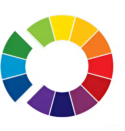
The Color Wheel
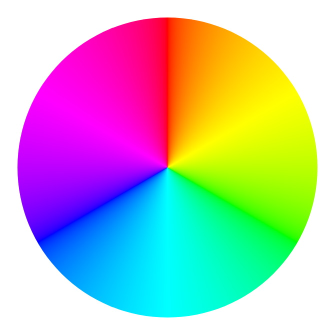
The color wheel is a visual tool that helps you understand how colors interact with each other. It is divided into three main categories:
- Primary Colors: Red, blue, and yellow – these are the fundamental colors that cannot be created by mixing other colors. All other colors are derived from these three.
- Secondary Colors: These colors are formed by mixing two primary colors. For example, red + yellow = orange, blue + yellow = green, and red + blue = purple.
- Tertiary Colors: These colors result from mixing a primary color with a secondary color, creating an even broader range of shades.
Color Combinations to Make Your Artwork Stand Out
Complementary Colors
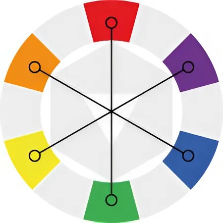
Complementary colors are two colors that are opposite each other on the color wheel, such as blue and orange or red and green. This contrast creates a strong visual impact and helps highlight specific elements in your artwork. However, excessive use of complementary colors can be overwhelming, so it’s important to balance them carefully.
Analogous Colors
Analogous colors are those that sit next to each other on the color wheel, such as green, teal, and blue. This type of color combination creates a calm, harmonious look and is often used in landscapes and soothing illustrations. While they do not provide as much contrast as complementary colors, they offer a smooth and natural feel.
Triadic Colors
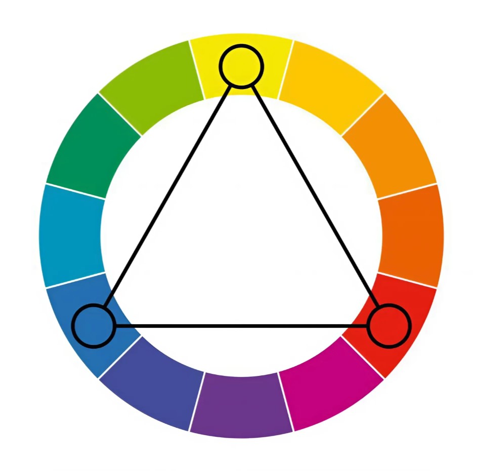
Triadic colors consist of three colors evenly spaced on the color wheel, such as red, yellow, and blue. This combination creates a dynamic balance between contrast and harmony, resulting in a vibrant and energetic effect. It is commonly used in abstract art and playful illustrations.
Monochromatic Colors
A monochromatic color palette uses only one main color in different shades and saturations. For example, a blue monochrome style can range from light blue to deep navy. This color scheme exudes elegance and simplicity, making it perfect for minimalist and refined artworks.
Mastering color combinations not only makes your artwork visually appealing but also helps convey emotions and express your unique style. Each color scheme has its own advantages, and choosing the right one depends on the mood and atmosphere you want to create.
If you are new to color mixing, start with the color wheel and experiment with different combinations. Don’t be afraid to explore unique palettes and develop your own creative style. Have fun coloring and make something extraordinary! 🎨✨
And don’t forget to check out AZkleur, where you can find a wide range of free coloring pages!